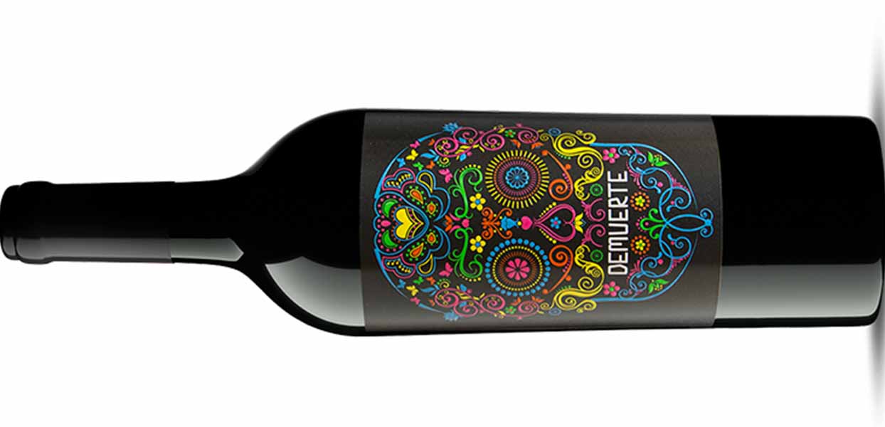
With the varieties of the DEMUERTE saga, the wine from our winery is dressed as a label, putting a special design note on our table. And is that today the appearance of wine bottles is as important as its content. Hence, the design of labels and packaging has become a discipline to take into account in the wine field. Especially in your marketing.
At WINERYON CREATIONS we have taken care, from our beginnings, on the design and appearance of our wine labels. Hence, our DEMUERTE saga is committed to an innovative design. A hallmark with which our wines differ from other wines wherever they are. An image with which they are easily recognizable around the world. But, above all, an aspect that materializes who we are behind the work of the winery, what the work we do is like and the quality of our wine offer. It is definitive, it explains how we are at WINERYON CREATIONS.

A label that crosses borders and defines the entire DEMUERTE saga
The label of our wines DEMUERTE is an original work that combines the image of the silhouette of a skull and the legend DEMUERTE.
Regarding the silhouette, it must be said that, depending on the variety of DEMUERTE it accompanies, it acquires one aspect or another, transmitting the personality and characteristics of the wine at a single glance. Thus, for example, for our DEMUERTE CLASSIC variety we chose bright and vivid colors, almost electric. A gesture that was almost a tribute to one of the most popular symbols of the Day of the Dead in Mexico. However, for the label of our DEMUERTE GOLD, how could it be otherwise, we opted for the same silhouette but with the lines in gold, thereby offering a message of elegance, luxury, party.
This adaptation of the label is carried out with all the wines of the series. Opting for one or the other colors and tonality. And even with luxury applications such as shiny inlays as in the case of DEMUERTE BLACK wine or absolutely amazing like DEMUERTE ONE that are visible in the dark.
The DEMUERTE legend always uses the same typeface, although as with the skull, it also changes color. Only in the case of DEMUERTE DELUXE wine is there a variation. In this case, the composition is expanded both at the bottom and at the top by acquiring a differentiating hue. What causes the label to appear more decorated than the rest, including even some watermarks on its outer frame.
A strong communication strategy is key to getting to the table
Strengthening the marketing strategy is a “must” after such sophisticated work.
Our fresh, suggestive and original image is also spread through our social networks and our blog. So that our followers are aware of our news and information. Information that we compose periodically in an unpublished way and with which we share ideas and suggestions for our clients, friends and acquaintances from all over the world.
And it is that in WINERYON CREATIONS we are lucky to have clients and followers from all over the world.
And, as a tribute to DEMUERTE customers spread over the five continents, we share images in which they are seen enjoying our wines. Something that makes us proud. If you want to see them, you just have to visit our accounts on Instagram @demuerte and Facebook (@DemuerteWine), where you will find many of them.


